Thursday, July 31, 2008

Marian Bantjes

I don't know much about Marian Bantjes, but she has tons of range in her style and some really, really sweet projects.


Friday, July 25, 2008

Paul Loebach


Blurb from Paul Loebach's website: Patterned after an ancient biblical proverb adopted by American quilters in the civil war era, positive and negative shapes are laser cut from wool felt and stitched back together. The two resulting quilts are inverse matches, made with zero waste. Designed with Jessie Henson.

found via design*sponge

Tuesday, July 22, 2008

Mat Daly


I own this poster by Mat Daly… it's framed and hanging in my apartment. I love it's neon-ness and particularly the camouflaged type. Many of his posters have some form of hand drawn type, here's a few examples:


Monday, July 21, 2008

UrbanOutfitters brand

I'm really trying my best-est to post each work day to my blog. And so I have to do a little more work on finding resources for inspiration… I have had a email subscription to UrbanOutfitters for quite sometime now. Although, I do buy things from Urban from time to time (most likely bedspreads to cut up into other things)… I mostly subscribe to the emails for visual inspiration. I like how they remain modern and throw-back at the same time. I like that they take risks. I like that they play with type. They certainly don't feel tied to any past "brand equity" fonts and images – although the character of the store stays true over time. They also manage to use web fonts like courier and times in an interesting way instead of looking cheap and thoughtless. Here's a few images I've collected over time that are inspiring:


Friday, July 18, 2008

it's all about me

A little glimpse into hand drawn lettering that I've been doing around the house and at work… (mind you, around the house and at work are the same thing)


I've recently started working for myself, and keeping receipts are more important than ever. I like the type on the Jill Bliss grid paper.

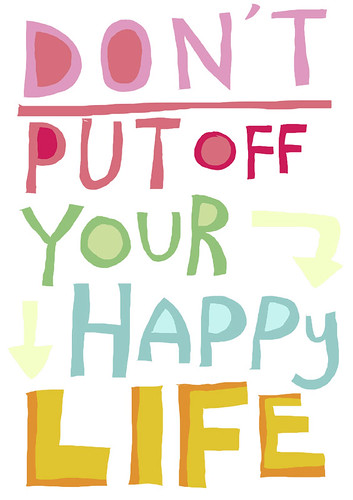
I tend to collect quotes, whatever fancies me at the moment. This is just my regular "everyday" handwriting.
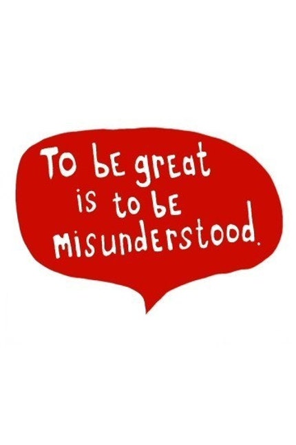

A "warning" message for a chili cook off a few months ago. Vegetarian chili with peanuts, yum. It's from my favorite cook book, the new american plate.


I worked on the know theatre website redesign a few months back when I was with Barefoot. I'm really pleased that I was able to incorporate some hand-drawn items, particularly as surprises in the navigation.

Thursday, July 17, 2008

Mike Perry


The second thing I discovered via design*sponge is Mike Perry. Sometimes I wonder how I don't already know these things. He seems to have an obsession with hand drawn type and such, was born and raised midwest, then relocated to brooklyn. Uhm, yeah, we should know each other.

He's put together two books on the subject 1. Hand Job: a Catalog of Type and 2. Over and Over: a Catalog of Hand-drawn Patterns

Chicago Type


I was reading design*sponge this morning and came across some new resources for hand drawn type… first of which is chicago type

Friday, July 11, 2008

smart content


This is my current wall paper. I like what it says. And I like Linzie Hunter's concept: Spam One-Liners. I need a good way to generate content for my own type drawing fun.